


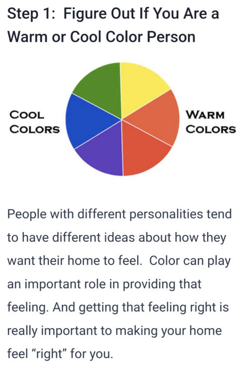
Great how-to articles on whole-house color schemes
kl23
9 months ago
Featured Answer
Sort by:Oldest
Comments (49)

kl23
9 months agokl23
9 months agoRelated Discussions
Online color consultant for whole house paint scheme?
Comments (8)dasiychain01- that's good to know. I was thinking of using some bloggers who I thought seemed really knowledgable about color. Figured they might actually be better than an interior designer who is probably more skilled in furniture and things (also being in the NYC area, the one's near me are $$). I asked the builder about using the BM consultant (they use Benjamin Moore paint) but they said the way they get it isn't really through a store so there's no consultant? Not sure if that sounds right. I will double check. Since it's new construction there's nothing to match, it's just picking a bunch of things that work well together....See MoreWhole house color scheme
Comments (8)I've found that I can use all the colors and patterns that I love in my house, and have them be different from room to room (unless you have a completely open plan house) as long as the color intensity is kept more or less at the same level. By that I mean that having one room with all very dark colors and another room with very pale colors will make the house look disjointed. In addition to that if the style of your decorating is fairly uniform from room to room that will also have a unifying effect. Going from Swedish modern to English country will never work, even if you carry the same colors throughout. If you have a fairly consistent style and a palette of colors that is of a similar intensity (the picture with your three beautiful pillows is a good example of that), then there's no need to overthink the process; just allow yourself to buy the things you truly love in the colors you love. It will all come together beautifully and your home will have individuality and character without your having to agonize over rules with every purchase....See MoreWhole house color scheme using Sherwin Williams paint
Comments (1)A local consult from a designer will be the best money you spend on the project. Colors need to be chosen in the light that they will be viewed, and with the phish all samples of the products right there in front of you. You cannot choose colors online....See MoreWhat do you think of either of these coffee tables?
Comments (136)@KL I circled the unfinished portion on the photo. I don't have a finished photo on my phone and I'm not home. I have never tried to sell anything. For half a second I thought about trying to teach people with no artistic experience how to paint faces using oil, wax, a knife, and an outline. I did paint a portrait on Zoom while guiding a friend who was working on the same painting and outline. It was fun! I have given a few paintings away. I think this style table would be easy to market because people could pick any combination of top and legs. Sort of like OshKosh B'gosh clothing for kids. Also, I would only have to flip the legs upside down to make plant holders....See Moreker9
9 months agokl23
9 months agokl23
9 months agoOtter Play
9 months agokl23
9 months agoOtter Play
9 months agochispa
9 months agokl23
8 months agokl23
4 months agokl23
4 months ago
ilikefriday
4 months agolast modified: 4 months agokl23
4 months agoilikefriday
4 months agolast modified: 4 months agoOtter Play
4 months agokl23
4 months agokl23
4 months agoilikefriday
4 months agolast modified: 4 months agoOtter Play
4 months agoOtter Play
4 months agokl23
4 months agoilikefriday
4 months agoOtter Play
4 months agokl23
4 months agokl23
4 months agoilikefriday
4 months ago
ShadyWillowFarm
4 months agokl23
4 months agokl23
4 months agokl23
4 months agokl23
3 months agoShadyWillowFarm
3 months agokl23
3 months ago
RedRyder
3 months agokl23
3 months agokl23
3 months agoRedRyder
3 months agokl23
3 months agoker9
last monthkl23
last monthker9
14 days agokl23
14 days agoker9
14 days agoilikefriday
13 days agoker9
13 days agoker9
13 days agokl23
13 days ago


Related Stories
DECLUTTERING5 Ways to Jump-Start a Whole-House Decluttering Effort
If the piles of paperwork and jampacked closets have you feeling like a deer in the headlights, take a deep breath and a baby step
Full Story
COLORPick-a-Paint Help: How to Create a Whole-House Color Palette
Don't be daunted. With these strategies, building a cohesive palette for your entire home is less difficult than it seems
Full Story
REMODELING GUIDES10 Tips to Maximize Your Whole-House Remodel
Cover all the bases now to ensure many years of satisfaction with your full renovation, second-story addition or bump-out
Full Story
HOUZZ TOURSHouzz Tour: Whole-House Remodeling Suits a Historic Colonial
Extensive renovations, including additions, update a 1918 Georgia home for modern life while respecting its history
Full Story
ARCHITECTUREHouses Exposed: Show Your Structure for Great Design
Why take part in the typical cover-up when your home’s bones can be beautiful?
Full Story
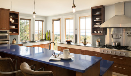
KITCHEN DESIGNPalatable Palettes: 8 Great Kitchen Color Schemes
Warm and appetizing or cool and relaxing? These 8 paint palettes can help you choose the best colors for your kitchen
Full Story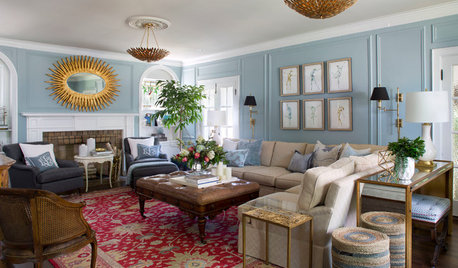
TRADITIONAL HOMESHouzz Tour: Beautiful 1929 Tudor-Style House Made Whole Again
A thoughtful renovation reveals original architectural details and removes an unfortunate 1980s addition
Full Story
DECLUTTERINGNo Time to Declutter the Whole House? Try These 6 Ideas
Make a fresh start by tackling a few tasks that will revitalize your home and your spirits
Full Story
HOUZZ TOURSHouzz Tour: A New Shower Leads to a Whole-House Remodel
Cohesion is the new name of the game for this transformed Arizona home, a dramatic departure from its former awkwardness
Full Story
LIFEThe Polite House: On Dogs at House Parties and Working With Relatives
Emily Post’s great-great-granddaughter gives advice on having dogs at parties and handling a family member’s offer to help with projects
Full Story


ilikefriday